Rebranding a .ORG
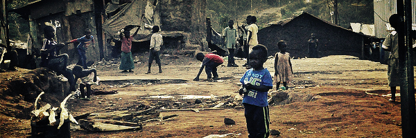
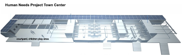
Founded by actress Connie Nielsen and leading green builder David Warner, HNP's mission is to create game-changing infrastructures called 'Town Centers' in poverty-stricken areas of the world, beginning in Kibera, Kenya. The Town Centers will provide fresh water, electricity, healthy food, education, Internet, and access to micro-credit using methods that are both ecologically and economically sustainable. It's a revolutionary idea we are convinced will better the lives of those who need it most.
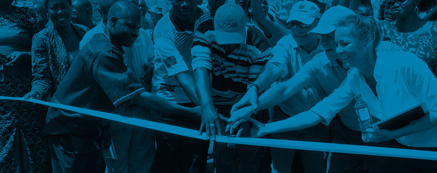
Recently we attended a gathering of more than 60 HNP contributors from all over the world to celebrate the Kibera groundbreaking. The event was hosted at the Berkeley home of tech legend and HNP team member, John Gage. Attendees included architects, economists, engineers, sustainability experts, volunteers – and of course, Marker Seven :)
This was also the first chance for key contributors to present their work to the group as a whole. Our portion of the presentation focused on our rebranding work for HNP.
Our Role
While we were initially brought on to develop the HNP website, it became clear early on we needed to take a step back and look at completely rethinking its identity for several reasons:
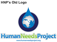
- The preexisting 'globe in a droplet' concept was being used by at least five other non-profits creating quite a bit of brand dilution. We wanted the logo to be distinctive and not look like everybody else.
- Although water is an important aspect of what HNP offers, it's just one of many important facets of HNP’s success model. Putting a strong visual emphasis on water really painted an inaccurate picture of everything that HNP does.
- The logo needed to be simplified so it could be used on a variety of media including physical property like tools and machines at the construction site. We knew if the logo couldn’t easily stenciled out of cardboard it wasn’t going to be practical.
During our Discovery phase with HNP, we narrowed down key terms describing HNP's organizational persona:
- Accessible - The Town Centers will be open to the public and provide access to resources we often take for granted in developed countries.
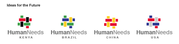
- Reproducible - The goal is not to create just one Town Center, but many all over the world. It is designed so that if the model works in Kenya, it can work in Brazil, India, China or wherever needed.
- Interconnected - The project thus far has been developed by a globally disparate, yet highly coordinated team.
- Centric– The very concept of the ‘Town Center’ is a community hub that is central not only in location, but in the part it plays in residents’ lives.
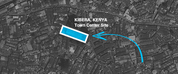
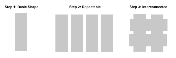
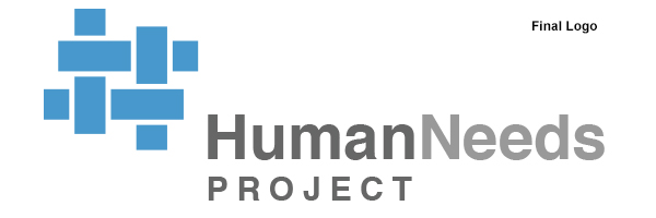
After a lot of research and conceptual thinking, we kept coming back to an aerial illustration of the Town Center’s basic shape, a simple rectangle. We worked with the rectangle concept make it represent all of the key terms.
We developed an identity composed of four repeating, interconnected rectangles arranged around a central space that is accessible from all directions.
For the color, we selected bright blue as a nod to the original clean water concept since, without clean water, the project would be impossible.
Finally, we wanted to start thinking beyond HNP’s initial Kenya project. In time, when Town Centers start popping up all over the world, there’s a great opportunity to localize the identity based on each country’s national colors.